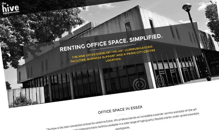
The Hive is a dedicated business hub for start-up and growing businesses specialists based in the old library building in Southend-on-Sea, Essex. Back in August 2015, they invited local web design teams to tender for the redesign of thehive.org.uk. The new website had to be “innovative & market leading”, “easily updated in-house” and “created by a team they loved”.
Collaboration
The project required not just the development of a responsive CMS driven website with event functionality but extensive branding & identity work, to promote The Hive Enterprise Centre and its services. Philip Ayers of Inkygreen was brought on board to use his in depth branding, design & print knowledge.
The Pitch
We met CEO Mark Kass, with Operations Manager Seb Coombs to put forward our vision for the new website.
Pitch – Structure
- Introductions
- Credibility
- Past Case Studies
- Vision
- Solutions
- Methodologies
- Awards
- Hosting
- Costing
- Support & after care
- Initial Identity Ideas
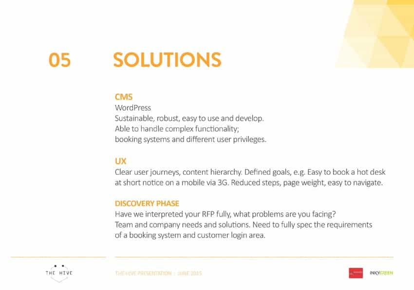
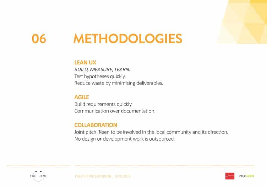
Here’s an excerpt from our web design pitch, in which we discussed the solutions and methodologies to be used.
Pitch – Solutions Slide
Pitch – Methodologies Slide
The Competition
We were allocated an hour, pitching against ten strong web design teams from across Essex, including agencies from Leigh-on-Sea, Southend and Colchester. Late the same day, we received the great news that we had been successful!
“We were really impressed with your pitch, your experiences and your clear understanding of The Hive Vision and Mission and as such, I’m pleased to confirm that we would like to appoint Measured Designs as our web development partners commencing works immediately. It is also a real pleasure to support two local guys and more-over, two guys who “get” our concept of Tech City on Sea!” – Mark Kass
Old Website
The previous website was built using Go Daddy’s website builder, constructed in house with a templated theme. Whilst they wished to maintain their current email solution, they had outgrown their simple hosting package and found their overall “online presence likely to be deterring take-up”. The one-page site had little SEO value and wasn’t a fair representation of the business or its ambitions.
The Hive – Business Hub Website Design
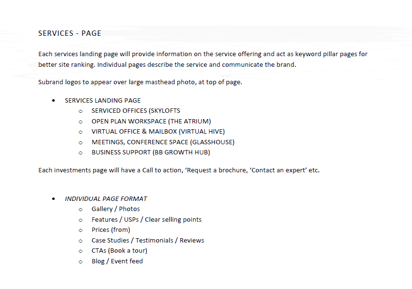
After a discovery consultation with The Hive CEO Mark Kass and Operations Manager Seb Coombs, Measured Designs drew up a proposed site structure, identifying key service pages.
Keyword research was also undertaken to define which terms were likely to be popular and should form the headings, URLs and content of these key pages.
Site Structure
Here’s an excerpt from The Hive’s site structure document;
Design Focus
The homepage was to have a clean design, with horizontal main navigation, large hero image with overlaid elevator pitch. Basic content hierarchy rules would be followed, with more important content higher up the page and larger. The content would be sectioned into rows for a more consistent responsive layout.
Dynamic Content
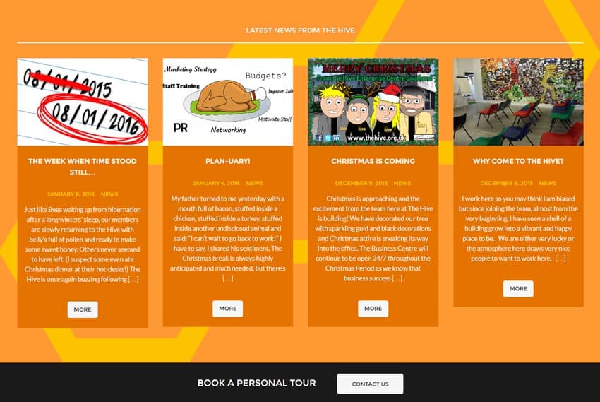
These largely static pages would be interspersed with dynamic content such as latest posts, events and tweets, to keep the pages fresh and updated. Clear CTAs (Calls To Action) and related posts and events, were placed to encourage content recirculation, increased leads and sales.
The mobile first design approach, meant each element or feature had to have a defined purpose before appearing on the site.
Branding Of Services
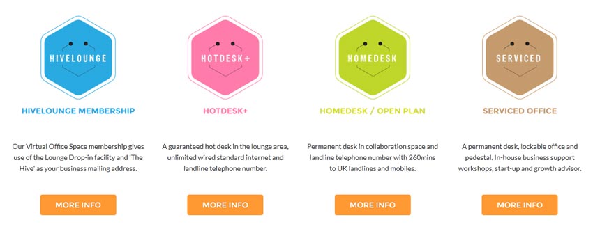
The Hive has a range of office space offerings, each now has its own sub brand emblem, name and defined features.
The client originally proposed that the services would be named after designated areas of The Hive building. However, this proved to be a confusing user experience (some areas were shared) and had low SEO value, services were displayed on the site primarily by their type;
- HiveLounge Membership / Virtual Office Space
- Hot Desk+
- HomeDesk / Open Plan
- Serviced Office
This helped to simplify the different memberships available, their benefits and location in the building.
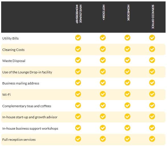
A responsive comparison table was also created to allow site visitors to easily assess the benefits of each service.
Service Comparison Table – Desktop
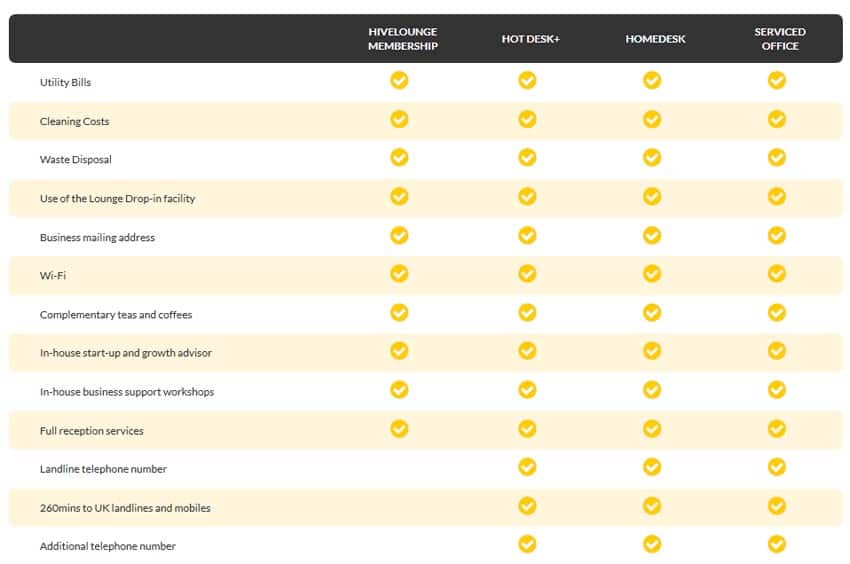
The table uses font icon arrows to crisply display which features are included, on high resolution devices. The small arrows also allow the table to be condensed for mobile, with the headings now being displayed vertically.
Service Comparison Table – Mobile
Events Post Type
A new custom post type was created for events. Each CMS entry for an event requires a date, time, price, location and Eventbrite link. The event can also be shared on social media and suggests related events that may be of interest.
Testimonials / Feedback
The client was very pleased with the new website and project delivery.
I love the look and feel of the site and the branding is superb ..it looks clean, fresh, modern and quite cool so well done Andrew & Phillip!
– Mark Kass
It’s always great to hear positive feedback from a client. Since the October launch, they’ve gone from strength to strength, with building work now complete and several new businesses now located at The Hive. It was great to see the team again at the recent Christmas event and I continue to make modifications to the site.
Let Us Improve Your Website
With 16+ years of web design & development, Measured Designs have a great deal of experience in delivering successful websites. We love building sites for all sorts of businesses in WordPress and Magento. Have a look at our other WordPress client work and give us a call to discuss developing your website.
