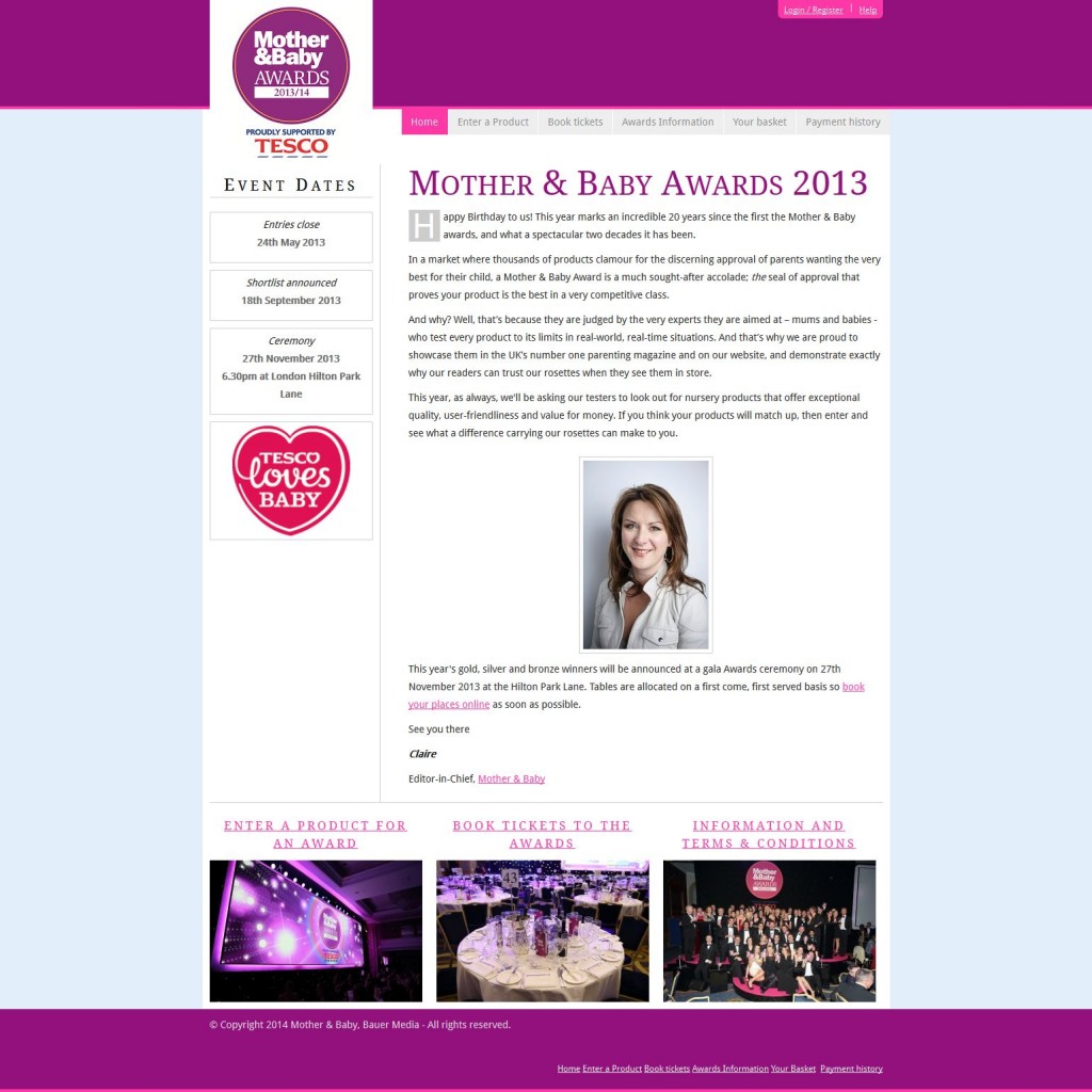
The Mother and Baby awards has been running for a staggering 20 years, issuing the “the seal of approval that proves your product is the best in a very competitive class”.
I was tasked with bringing a tired site back to life, without wholesale changes to existing codebase. Whilst the brief was quite restrictive, I still felt the failings of the old navigation and form layout had to be addressed, whilst the colour palette and typography could be made to better reflect the brand’s prestige and tie in with the Mother and Baby magazine.
As is common with many magazine owned legacy sites, M&B Awards suffered from small unreadable type, height restrictions on content, content hierarchy issues and poor UI.
With the new colour palette and subtle layout changes, I was able to make sections of the site much more clearly defined. Headers and copy were allowed to breathe and titling made much more obvious. The site’s role was not only to promote the event and to provide dates and information, but to allow for tickets to be bought. As such form layouts were also were made more initiative, and readable.
