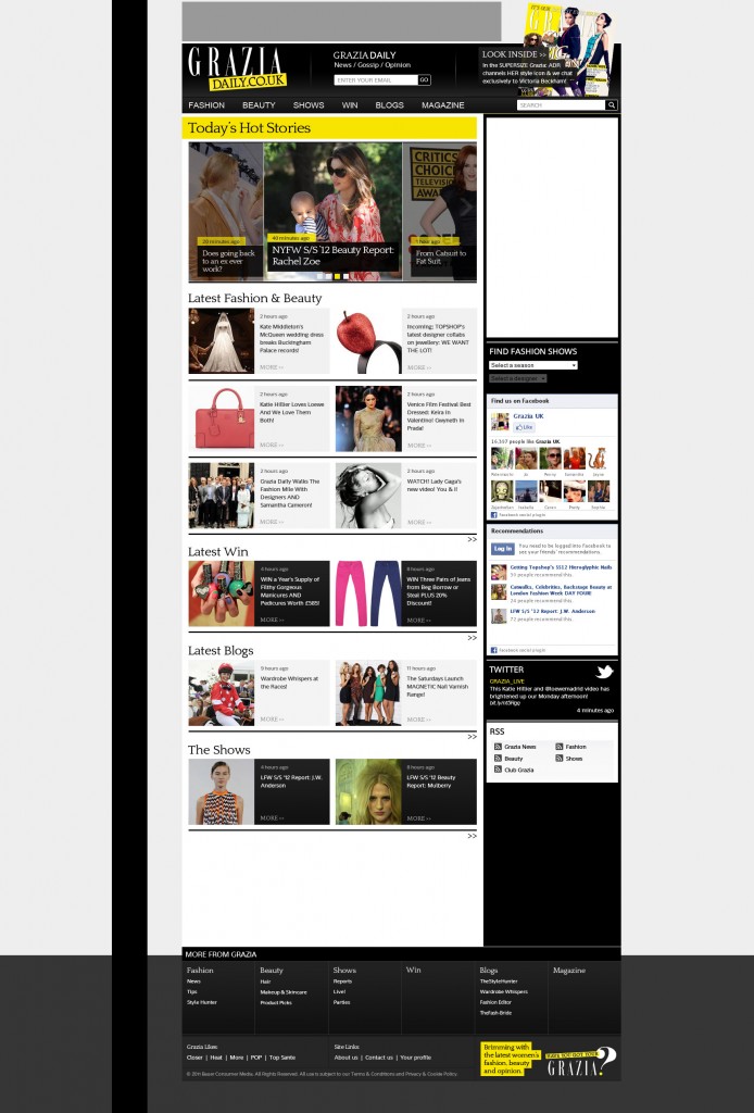
Grazia’s existing website had become tired, failing to promote the brand and live up to the glossy, premium feel of the magazine. I was tasked with revamping the design, whilst restructuring the site to give order to the homepage and landers, making it easier to digest content and move through the site.
Prominence was given to the core visuals of the magazine, eye beautiful typography and striking photography, with previous non brand colours removed. The Grazia yellow was warmed up to make it more web friendly, with black and greys used to define the layout and reinforce content hierarchy.
The build of the site was conducted by an out of house agency, who also host the site. Although I later developed a series of media query styles to make the 960 grid markup responsive.
Gallery
Developed using PHOTOSHOP, ILLUSTRATOR.
