Kerrang! has a vast, active audience on Twitter and Facebook, but had little traction on its outdated website. It’s core audience of teens and young adults found the site difficult to use and especially clunky on mobile devices.
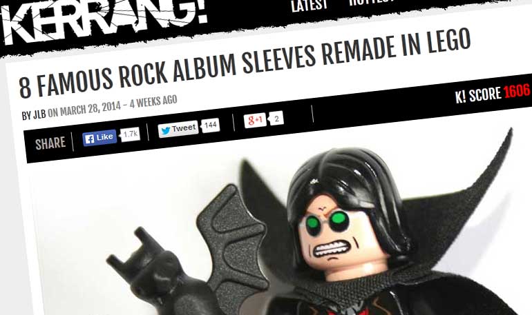
So we went back to the drawing board, completely re evaluating the site’s direction and purpose, looking at the needs of current users, the editorial staff, ad sales and marketing. The goal of the new site was to deliver a site that looked great across all platforms and devices, with highly shareable content easy to find and view on the move. Gallery and list item articles were given central billing, seen as essential to delivering high levels of social media interaction and page views.
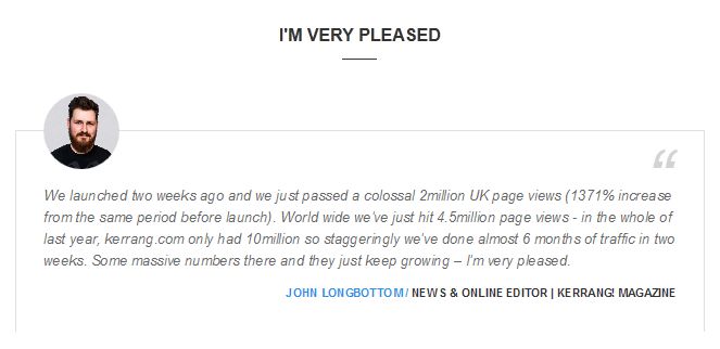
Moving kerrang! from Movable Type to WordPress, a much more robust CMS platform the editorial team found it much easier to produce content. Regular posts, galleries, polls and opinion pieces, saw their post views sky rocket.

Significant UX improvements, content recirculation and easier user interaction with the site (comments, hottest posts, SM reach) created the publishing platform that kerrang! has sought for many years.


